
Every Step Matters: The Story Behind TRIO-Fit’s Medal Design for Steps for Memory – Edition 3
A medal that celebrates not only the finish, but also the purpose behind every step.
On 11 September, Hatirjheel, Dhaka, hosted Steps for Memory: Run for Dementia Prevention | Edition-3, organized by Doctor’s Run. With 15KM and 7.5KM race categories and 1,000+ runners, the event brought together a community united by movement, awareness, and a shared commitment to dementia prevention.
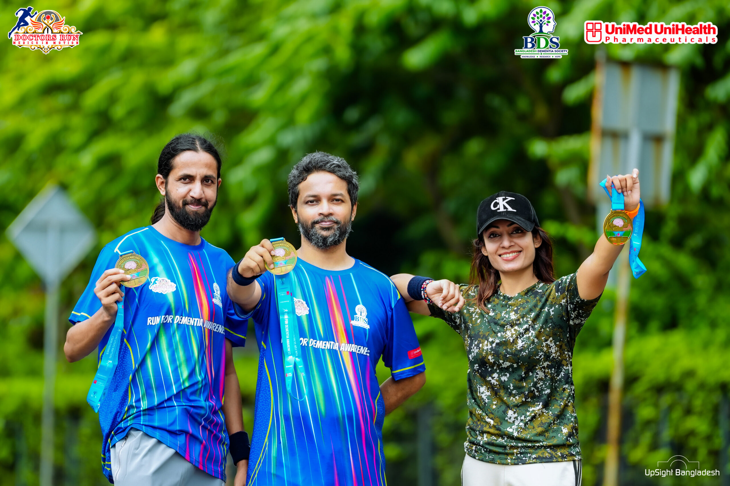
Designed by TRIO-Fit, the official Finisher Medal was created to preserve that experience in a meaningful and memorable form. While the event jersey expressed energy and movement through vibrant colors, the medal transformed the event’s purpose into a lasting Commemorative Design.
A Medal with a Story to Tell
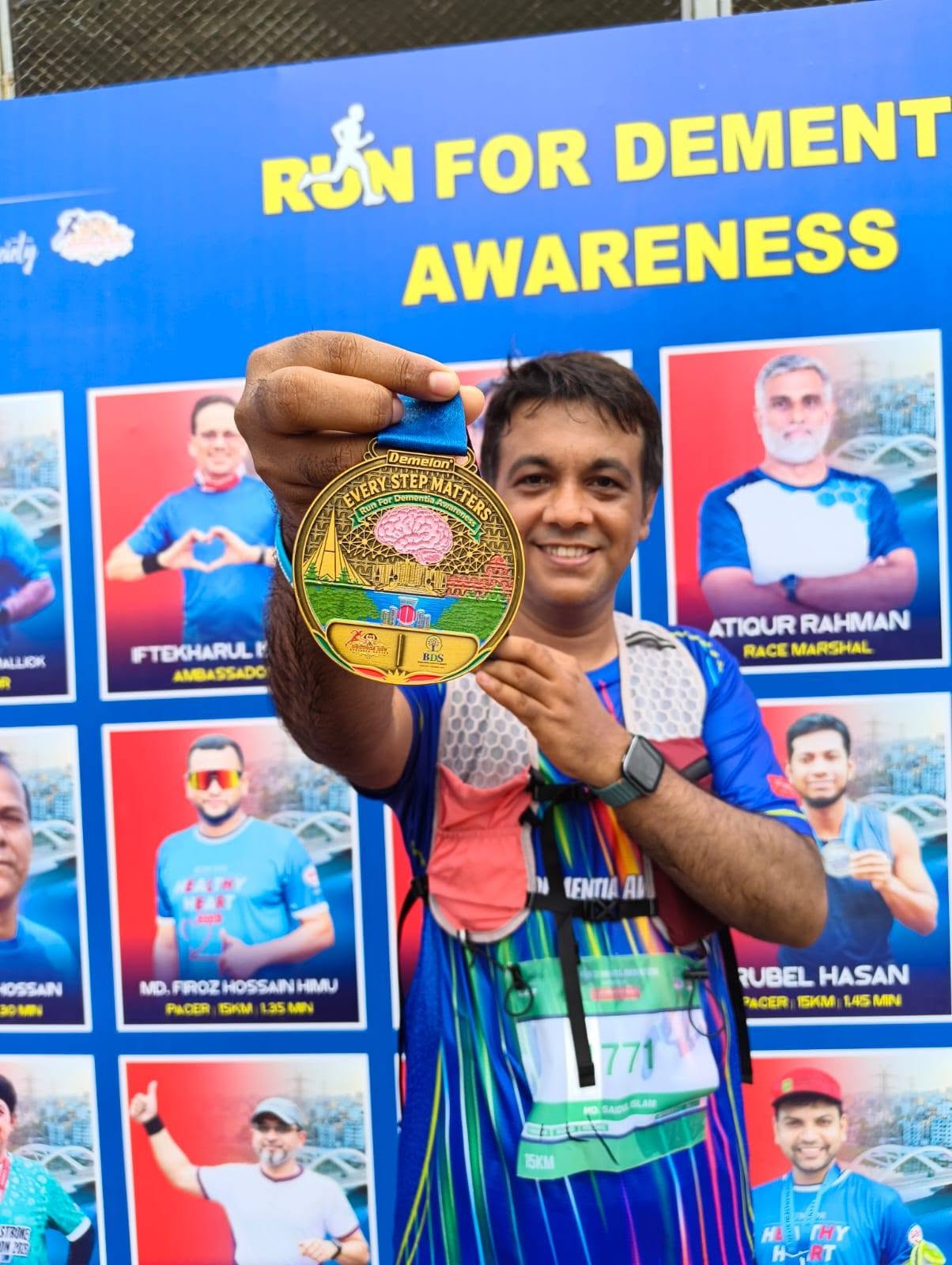
The medal is more than a traditional circular race souvenir. Its design brings together several meaningful elements to create a Visual Narrative.
At its center is a Brain Illustration, representing the core message of Dementia Awareness. Around it, the words “EVERY STEP MATTERS” reinforce the idea that every individual effort contributes to a larger purpose.
The medal also features:
- Brain and Neural Network-inspired details — symbolizing memory, connection, and awareness.
- “Run For Dementia Awareness” — clearly communicating the event’s purpose.
- Hatirjheel-inspired landmarks and surroundings — connecting the medal to the event’s location.
- Doctor’s Run and BDS branding — preserving the identity of the organizers and awareness initiative.
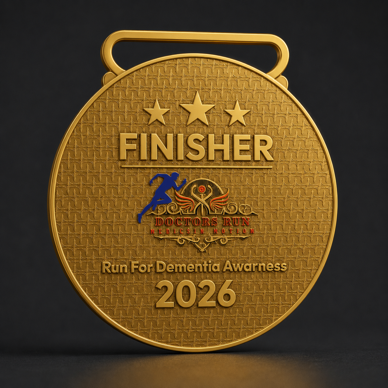
- Finisher and 2026 details — marking the achievement and the year of participation.
Together, these elements turn the medal into a Symbolic Event Souvenir rather than simply a race completion token.
The Brain: A Symbol of Awareness
The Brain Illustration is the central visual element of the medal. Its presence immediately connects the design to the event’s focus on dementia awareness.
Surrounding the brain are Neural Network-inspired patterns, adding depth to the concept of memory and cognitive connection. This detailing gives the medal a stronger visual relationship with its purpose, making the design feel intentional rather than purely decorative.
It is a clear example of how Symbolic Design can communicate an event’s message without relying on excessive text.
“EVERY STEP MATTERS”: The Message at the Heart of the Design
The phrase “EVERY STEP MATTERS” is one of the medal’s most powerful design elements.
In a running event, every step contributes to reaching the finish line. In an awareness campaign, every action contributes to building understanding and encouraging positive change.
The typography therefore serves two purposes: it identifies the event’s message and adds a Motivational Layer to the medal. For every finisher, it becomes a reminder that their participation was part of something larger than a race.
Hatirjheel as Part of the Memory
The medal’s illustrated landscape includes Hatirjheel-inspired architecture, water, greenery, and urban surroundings.
This gives the medal a distinct Location-Based Identity. It is not just a generic running medal; it is connected to the place where the event took place.
For participants, that connection makes the medal more personal. It preserves not only the achievement of completing the race, but also the memory of a particular day, a particular route, and a shared experience at Hatirjheel.
Gold Finish with Vibrant Details
The medal’s Gold-tone Finish gives it a premium and celebratory appearance, reflecting Achievement, Recognition, and Finisher Pride.
At the same time, the use of Green, Blue, Red, and Pink accents adds a lively character to the design. These colors create contrast against the gold surface and help the central illustrations stand out.
The result is a medal that combines Traditional Finisher Medal Prestige with a more Contemporary, Colorful, and Detailed Aesthetic.
Front and Back: Two Sides of the Same Story
The Front Side focuses on the event’s purpose, featuring the brain illustration, awareness message, and Hatirjheel-inspired visual elements.
The Back Side emphasizes achievement and identity through “FINISHER,” “Run For Dementia Awareness,” “2026,” and the Doctor’s Run branding.
Together, both sides create a complete Commemorative Experience—one side tells the story of the cause, while the other celebrates the accomplishment.
A Unified Identity with the Event Jersey
The medal and official jersey were both designed by TRIO-Fit, creating a consistent Event Branding System.
The jersey communicates energy through its Vibrant Blue base, Multicolored Lines, and Dynamic Pattern. The medal carries that same event spirit into a more symbolic form through its Brain Illustration, Gold Finish, and Awareness-focused detailing.
Although the two designs serve different purposes, they share a common visual language: Movement, Awareness, and Participation.
This consistency helps the event feel more complete, with every major visual element contributing to one recognizable identity.
More Than a Finisher Medal
A meaningful medal becomes valuable not only because of its material or appearance, but because of the Memory attached to it.
TRIO-Fit’s medal design for Steps for Memory: Run for Dementia Prevention | Edition-3 brings together Purpose, Symbolism, Local Identity, and Achievement in one lasting piece.
From the central brain illustration to the “EVERY STEP MATTERS” message, from the Hatirjheel-inspired landscape to the gold finish, every element contributes to a medal that celebrates both the race and the reason behind it.
On 11 September, as 1,000+ runners participated across the 15KM and 7.5KM categories, this medal became more than a reward for finishing. It became a Commemorative Symbol of Awareness, Participation, and Every Step Taken for a Purpose.
Designed by TRIO-Fit. Created to Celebrate Every Step.
TRIO-Fit
Sportswear & Event Design crafted with identity, purpose, and creativity.